How to improve the contrast effect of pictures
Photographs of common scenes in everyday life, such as street photos, portrait photos, and landscape photos, always contain several important objects or colors. For such photos, the highlights, shadows, neutral gray, and skin color are generally set. That is, you can adjust beautiful pictures and get better printing results.
But there are also other types of pictures, such as product pictures, animal pictures, food pictures, jewelry pictures, etc. The characteristics of such pictures are that one or two colors are the most important, occupying a large area of ​​the picture; while other small portions It's just a background. For such pictures, not only should the highlights, shadows, neutral grays, and skin color be adjusted, but also the contrast of important objects in the picture should be increased.
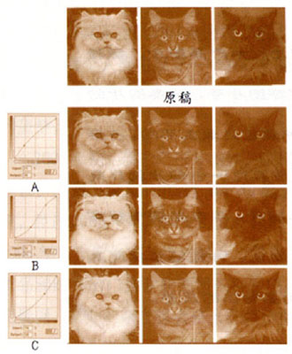
Fig. 1 Adjustment diagram corresponding to each adjustment curve
As shown in Figure 1, each image is a cat with very little background. If adjusting the picture makes the cat clearer and the background loses some details, this is acceptable.
The white cat in the picture will occupy the brighter tone portion of the Curves curve; the black cat in the picture will occupy the darker tone portion of the Curves curve, while the gray cat will occupy the middle tone part of the Curves curve.
You can find out the exact range of tones in the Curves curve. Place the mouse on the highlights and shadows of each cat and record the numbers on the information panel. There is also a way to use the Curves curve of a single channel, hold down the mouse to move on the picture, a circle will appear on the Curves curve to indicate the value of the position of the mouse at this time.
The highlights and shadows in the picture were originally correct. Use the curves shown to increase the contrast. We should carefully consider the effects of various curves on picture cats.
In the figure, there is a big difference between each column of cat pictures and each row of cat pictures. Each steep curve in (Figure 1) applies to a particular cat, increasing its contrast. However, the range of tones in the other two cat pictures is flattened, the contrast becomes smaller, and the gradation is lost. The adjustment at this time is like shopping: on the one hand, it will buy something, on the other hand it will lose money. Or use a better metaphor, like a transaction, get what you want, but you can also lose something you don't want.
Each of the three curves will always adjust a good cat picture. From the second line below, the gray cat picture in the middle is adjusted well, while the other two pictures are the worst.
And why increase the contrast curve of gray cat pictures, white cat pictures and black cat pictures become so bad? The answer is a question of the scope of the tone. Grey cat pictures have the largest range of tonality (the white cat picture has the lowest gradation range), so it has the longest range in the Curves curve. When correcting, the area that needs to be lost is the most.
It can be seen from the effect of adjustment (Figure 1):
The brighter tone portion of Curves curve A is steeper and is suitable for adjusting white cat pictures, adjusting more white cat details, and increasing the contrast of white cats.
Curves curve B has a steeper intermediate tone and is suitable for adjusting grey cat pictures, adjusting more details of gray cats and increasing the contrast of gray cats.
The darker tone portion of the Curves curve C is steeper and is suitable for adjusting black cat images, adjusting black cats more details, and increasing black cat contrast.
We can specify that the white cat picture is a bright tone picture; the black cat is a dark tone picture; the gray cat is a midtone picture.
Most pictures contain both brighter and darker tone, but in a variety of ways. For example, a picture of a grass field is green. In CMYK mode, green is mixed by yellow and blue. And in the green of nature, yellow still plays a major role. In the grassland picture, it is yellow, green, and magenta.
In other words, in the grassy picture CMYK four-color channel, the yellow channel is a dark picture, and the magenta channel is a bright picture.
For another example, the yellow channel is a black cat picture, the magenta channel is a white cat picture, and the blue channel is a gray cat picture. You can adjust this picture using a curve similar to (Figure 1).
Use three different curves to adjust three different cat pictures. This is why the main channel curve is not used when adjusting the picture, but only a single channel curve is used. Because we have already seen the effect of using a curve to adjust three cat images, it is not ideal.
In order to be able to adjust CMYK pictures, you need to realize that instead of adjusting a color picture, you can adjust four black and white pictures. Each can be individually adjusted, but four are mutually influenced.
If the highlight in a picture is correct, the dark tone is 70C70M70Y70K. This value is reddish because there is not enough blue ink. Use 80C instead of 70C. Therefore, it needs to be adjusted.
The easiest way to think of this is that in the cyan channel, drag the 70C point on the curve upwards by 10; the second method is to drag the point in the upper right corner horizontally to the left, keep a straight line, and become steep. There are many other ways to make 70C become 80C, as shown in (Figure 2). Which one should I use?
Figure 2 If the goal is to adjust the value of 70 to 80, the above and each curve can be done, but they have different effects on each part of the picture.
In practical applications, there may not be so many choices, because there are four basic conditions for adjusting the picture, that is, the highlight is correct, the dark tone is correct, the neutral gray is correct, and the skin color is correct. If there are no neutral grays and skin tones in the picture, you can use any of these four curves. But most of the pictures are not like this, so there must be two to three of these four curves that cannot be used at all.
Which one can you use?
The selected curve should be that the most important area in the picture is at the steep part of the curve.
Since color pictures can be viewed as an expansion of larger, more complex, more difficult-to-adjust black-and-white pictures, we used the above method to adjust the picture (Figure 3).
Figure 3 In the CMYK curve, the steeper part of the tiger (the brown part of the curve) is adjusted to help increase detail. (to be continued)
Hot Melt Adhesize Film,Hot Glue Sticks ,Plastic Glue ,Hot Melt Glue Gun
Transfer Paper Co., Ltd. , http://www.nbtransferfilm.com